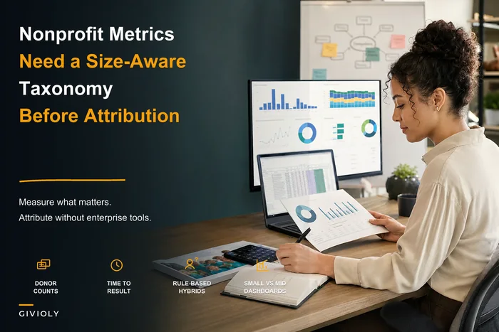

Your development director just forwarded an email from a major donor. They want quarterly impact data for their board meeting next week. Simple enough request — except your program data lives in three different systems, your finance tags don't match your program categories, and the last impact report took someone close to 40 hours to compile by hand.
This keeps happening because nonprofit impact reporting systems rarely get built right from the start. Most organizations patch together spreadsheets, PDFs, and the occasional Tableau dashboard without ever building the underlying operational infrastructure that makes reporting sustainable.
The Hidden Infrastructure Problem
When you map out reporting workflows for nonprofits, the same gaps show up every time. Program teams track outcomes in their case management systems. Finance tracks expenses in QuickBooks. Development tracks donors in their CRM. Marketing creates impact stories in Google Docs. Nobody owns the connective tissue between all of it.
The real problem isn't the tools — it's the missing operational layer that should sit between raw data and final reports. Without proper source-to-dashboard mapping, every report becomes a fresh archaeology project.
A mid-sized youth services organization ran into this directly. Their program director spent two weeks every quarter manually reconciling attendance data from three after-school sites with expense reports from finance, just to calculate cost-per-youth-served for a single foundation report. Meanwhile, their development team was pulling completely different attendance numbers from a separate enrollment database for the annual report. Same organization, two different numbers, no explanation.
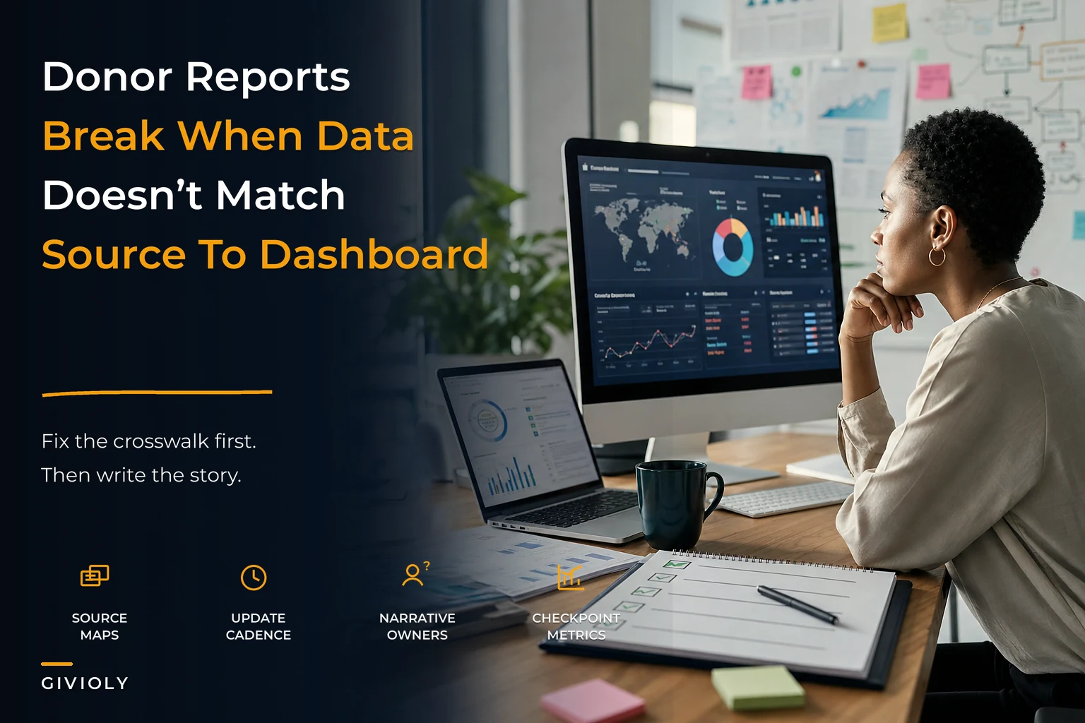
The solution wasn't more dashboards. It was building the crosswalk infrastructure that makes any dashboard possible.
Source-to-Dashboard Crosswalks That Actually Work
Most nonprofits try to jump straight from raw data to pretty charts. That's backwards. You need three distinct mapping layers before you touch any visualization tool.
Simplify donor management and fundraising workflows.
Givioly helps you organize campaigns, engage donors, and maximize fundraising impact seamlessly.
- Unified donor profiles
- Real-time donation tracking
- Automated impact reporting
No credit card required
Layer 1: Source System Inventory
-
Program databases (client records, service delivery, outcomes)
-
Financial systems (expenses, revenue, budget codes)
-
HR/volunteer systems (staff time, volunteer hours)
-
External data sources (government statistics, partner organization data)
For each source, document:
-
Primary data owner (who maintains it)
-
Update frequency (daily, weekly, monthly)
-
Export capabilities (API, CSV, manual only)
-
Known data quality issues (gaps or inconsistencies)
Layer 2: Canonical Data Model
This is where most organizations fall apart. You need a single source of truth for how concepts map across systems. When your case management system says "youth served" and your finance system says "program participants," are those the same thing? Usually nobody knows for certain.
Build a simple reference table:
| Canonical Term | Program System Term | Finance System Term | CRM Term | Definition |
|---|---|---|---|---|
| Unique Clients Served | Active Participants | Budget Line 5010 Recipients | Program Beneficiaries | Individuals who received at least one direct service in the reporting period |
| Service Hours | Contact Hours | Billable Units | Engagement Time | Total hours of direct service delivery, excluding prep/admin time |
| Program Costs | Direct Program Expense | Restricted Funds - Programs | Program Investment | All costs directly attributable to program delivery, including allocated overhead |
Without this crosswalk, every report interprets data differently. Your board sees one number, your foundation funders see another, and nobody can explain the gap.
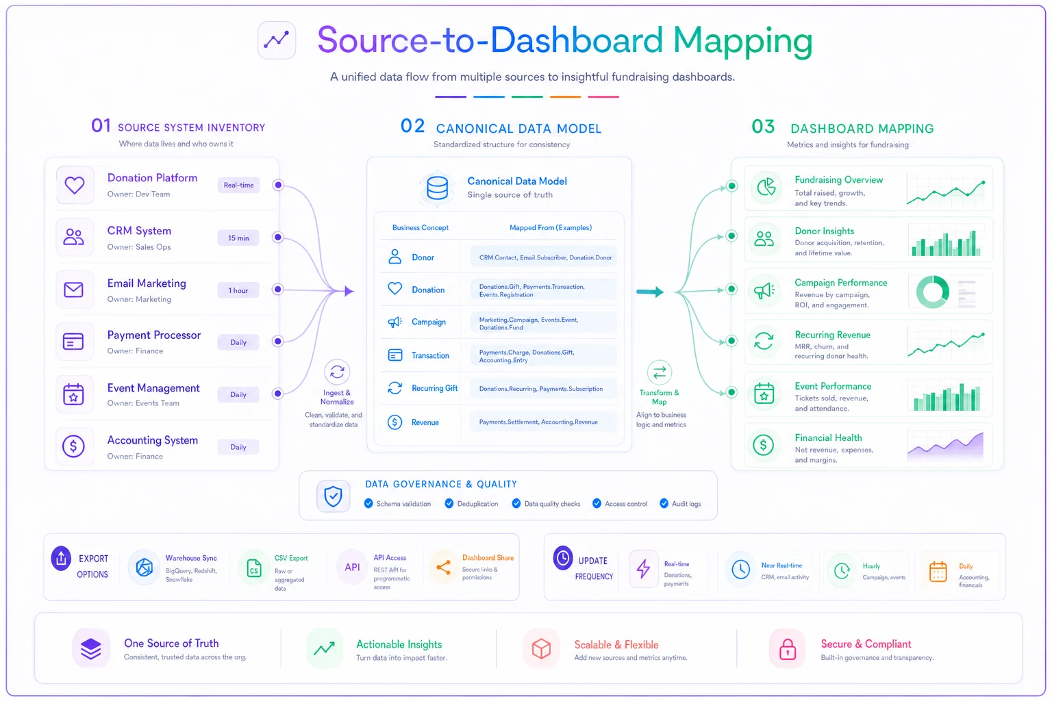
This visual shows how data flows from source systems through the canonical model to the final dashboards.
The solution wasn't more dashboards. It was building the crosswalk infrastructure that makes any dashboard possible.
Program-to-Finance Tag Alignment
The most painful reconciliation happens between program outcomes and financial data. Program teams think in activities and outcomes. Finance thinks in cost centers and grant restrictions. These two worlds rarely sync on their own.
A three-part tag structure is what actually bridges this:
-
Program Code (what program)
-
Activity Type (what kind of work)
-
Funding Source (who's paying for it)
Example: YTH-DIR-GOV
-
YTH = Youth program
-
DIR = Direct service delivery
-
GOV = Government grant funded
Every expense, every logged hour, every tracked outcome gets these tags. Now you can answer questions like "What's our cost per outcome for government-funded youth services?" without a three-day Excel deep dive.
The hard part is consistency. One organization solved this by embedding the tags directly into their expense approval workflow — no tag, no reimbursement. Harsh, but it worked. Within one quarter their tagging compliance went from spotty to near-complete.
Audience-Specific Narrative Templates
Different stakeholders need fundamentally different stories from the same data. Your board wants strategic insight. Individual donors want emotional connection. Foundations want rigorous metrics tied to their theory of change.
Most organizations write these narratives from scratch each time, which is why impact reports take forever and often read like they were written by committee — because they were.
Build narrative templates that pull from the same underlying data but frame it differently:
Board Template Structure:
-
Executive summary with three strategic insights
-
Performance against annual goals (visual dashboard)
-
Emerging trends and implications
-
Resource allocation effectiveness
-
Risk factors and mitigation
Individual Donor Template Structure:
-
One compelling client story (with data context)
-
Your donation at work (specific allocation)
-
Broader impact metrics (simple, visual)
-
Upcoming opportunities to engage
-
Personal thank you with a specific callback to their giving history
Foundation Template Structure:
-
Alignment to grant objectives (explicit mapping)
-
Outputs vs outcomes table
-
Cost-effectiveness analysis
-
Challenges and learnings
-
Sustainability plan
The templates aren't just about format. They're about pre-determining which data points matter to which audience. Your crosswalks should tag data elements by audience relevance, not just by source system.
Dashboard Wireframes Before Technology Selection
Every nonprofit wants to jump straight to "should we use Tableau or Power BI?" Wrong question. The right question is "what decisions will this dashboard actually support?"
Start with paper sketches. Literally draw boxes. Each box represents one metric or visualization. For each one, document:
-
Primary metric (what number)
-
Comparison baseline (compared to what)
-
Update frequency (how often it changes)
-
Data sources required (where it comes from)
-
Drill-down capability needed (what detail on click)
-
Action trigger (what happens if it's red/yellow/green)
A workforce development nonprofit learned this the expensive way after spending around $30k on a Salesforce dashboard nobody used. They'd built real-time enrollment charts, but their board only cared about job placement rates 90 days after program completion. The dashboard answered questions nobody was asking.
Their second attempt started with wireframes. They identified five metrics their board actually used to make decisions:
-
Cost per job placement (trending over 12 months)
-
Placement wage vs. living wage (by program type)
-
Employer retention rate (at 30, 60, 90 days)
-
Funding per participant vs. outcome (efficiency metric)
-
Pipeline health (participants by program stage)
They validated these wireframes with actual board members before building anything digital. Took three weeks longer to get started. Saved months of rebuilding.
The Production Checklist That Prevents Disasters
Impact reporting fails badly when someone discovers a data error after the report goes out. One decimal point in the wrong place, one filter applied incorrectly, and you're sending correction emails to hundreds of donors.
Here's the checklist that catches these errors before they leave your office:
Data Validation Phase:
-
[ ] Source data dates confirmed (reporting period correct)
-
[ ] Record counts match across systems (no missing data)
-
[ ] Duplicate detection run (no double-counting)
-
[ ] Outlier analysis complete (no data entry errors)
-
[ ] Year-over-year variance check (no impossible jumps)
Calculation Verification:
-
[ ] Formulas spot-checked with manual calculation
-
[ ] Denominators verified (right population base)
-
[ ] Percentage totals sum to 100% where applicable
-
[ ] Financial allocations match approved methodology
-
[ ] Overhead allocation consistent with prior reports
Narrative Alignment:
-
[ ] Numbers in narrative match dashboard/tables
-
[ ] Period references consistent throughout
-
[ ] Client stories fact-checked with program staff
-
[ ] Quotes approved by sources
-
[ ] Photo permissions verified
Stakeholder Review:
-
[ ] Program director sign-off on outcomes data
-
[ ] CFO sign-off on financial data
-
[ ] Development director review of donor recognition
-
[ ] Executive director final approval
-
[ ] Board chair preview (for board reports)
Technical Production:
-
[ ] PDF accessibility check (screen reader compatible)
-
[ ] File size under email limits
-
[ ] Backup calculation files archived
-
[ ] Version control documented
-
[ ] Distribution list verified
Require named sign-offs to improve upstream data quality.
The checklist matters beyond catching errors. When people know their sign-off is required, data quality tends to improve upstream — people are more careful when they know their name is attached to it at the end.
Common Failure Points at Scale
Small nonprofits can manage impact reporting through sheer individual effort. Someone stays late, pulls the data manually, writes the narrative, and makes it work. But somewhere around $2M in annual budget, those workarounds start breaking down.
The first crack usually shows up when reporting frequency increases. Quarterly becomes monthly. One foundation wants weekly updates. That 40-hour quarterly process suddenly becomes a full-time job.
The second failure point comes with stakeholder complexity. You go from three major funders to fifteen, each wanting different metrics, different definitions, different reporting periods. Your canonical data model becomes a negotiated treaty between competing requirements.
The third breaking point is staff turnover. The person who understood all the Excel formulas leaves. Their replacement finds undocumented calculations, mystery adjustments, and pivot tables referencing files on someone's personal drive.
This is where operational discipline matters more than technology. One education nonprofit with roughly a $4M budget avoided these failures by implementing three policies:
-
No impact metric gets reported without a documented calculation methodology
-
All report production follows the written checklist, regardless of urgency
-
Every custom report request triggers a sustainability review (can we actually do this repeatedly?)
These felt bureaucratic at first. Six months later, when their report coordinator went on maternity leave, the development assistant produced the quarterly impact report without missing a deadline. That's what good systems look like in practice.
Building Tomorrow's System Today
The impact reporting infrastructure you build today determines what questions you can answer tomorrow. Most organizations build for today's grant report, today's board meeting, today's campaign. Then tomorrow arrives with new requirements and the whole system needs rebuilding.
The crosswalks, templates, and checklists covered here aren't just about efficiency — they're about capability. When a major donor asks for longitudinal outcome data cut by demographic factors and funding source, you either have the infrastructure to answer that or you don't.
One environmental organization found this out during a capital campaign. Potential major donors wanted five-year impact trends with cost-effectiveness metrics. Because they'd built proper source-to-dashboard mapping two years earlier, they could generate those custom reports in hours rather than weeks. That infrastructure contributed directly to securing $2.8M in major gifts.
The dashboards themselves matter less than the operational foundation beneath them. Whether you use Tableau, Power BI, Google Data Studio, or Excel, the quality of your impact reporting depends on the quality of your crosswalks, the clarity of your templates, and the discipline of your production process.
Start with the source-to-dashboard mapping. Get program and finance speaking the same language through shared tags. Build narrative templates that respect different audience needs. Create wireframes that validate which metrics actually drive decisions. Then implement the production checklist and stick to it.
None of this infrastructure work is exciting. It doesn't create immediate donor engagement or program outcomes. But it creates the operational capacity to tell your impact story consistently, accurately, and compellingly — at scale, without it becoming a crisis every single quarter. Once these systems exist, adding new data sources, new audiences, or new visualizations becomes incremental work rather than a rebuild from scratch. That's when impact reporting stops being a quarterly emergency and starts being something your organization is genuinely good at.
Ready to elevate your fundraising efforts?
Join 2,000+ nonprofits using Givioly to save time, increase donations, and build lasting donor relationships.