


Most nonprofit finance conversations still hinge on one number: what percentage of the budget went to "overhead." Boards ask about it. Charity rating sites publish it. Development directors dread it. And in almost every case, that number tells you almost nothing useful about how your fundraising actually performs.
The problem isn't that overhead ratios exist. It's that they get treated as a proxy for efficiency when they're really just an accounting artifact — one heavily shaped by how you decided to split shared costs in the first place. A grants manager who spends 60% of her week chasing a federal report is "program" or "overhead" depending on a coding decision someone made three years ago and never revisited.
This piece is about fixing that. Specifically, using a lightweight version of activity-based costing — with time-driven activity coefficients — to attribute shared costs to actual fundraising activities, so leadership sees real cost-to-raise numbers instead of a blended ratio that hides the truth. It's less complicated than it sounds, and you don't need a CFO or a consulting engagement to pull it off.
Why the Standard Overhead Split Falls Apart
Walk into most small development shops and the cost allocation method is some version of: salaries get charged to whatever program the person is nominally assigned to, and shared costs get spread by headcount or by revenue. It looks clean on a spreadsheet. It's also wrong in ways that actively mislead the people making decisions.
The core issue: shared costs — your database, your finance staff, your ED's time, rent, the donor CRM everyone touches — don't get consumed evenly. A capital campaign might chew through 40% of the database admin's month while generating a fraction of the gift volume of your recurring giving program. If you split that admin's cost by revenue, the recurring program absorbs a cost it never caused. Leadership then looks at the numbers and concludes recurring giving is expensive and the capital campaign is lean. Both conclusions are backwards.
What happens across a lot of small orgs is that the allocation method quietly becomes the strategy. Programs that happen to absorb shared costs cheaply look efficient, so they get more attention and budget. The ones that genuinely drive long-term value but require heavier operational support look bloated. Nobody decided this on purpose. The accounting method decided it for them.
The fundraising overhead allocation problem gets worse the moment restricted funds enter the picture, because now you're not just misinforming leadership — you're at risk of misreporting to funders. If shared costs are allocated arbitrarily, your grant-funded program budgets don't reflect what those programs actually consumed. (If restricted funds are a significant part of your world, the tagging and reconciliation approach in our grant and restricted funds tracking workflow pairs directly with what follows.)
The Shift: From Cost Centers to Activities
Activity-based costing flips the logic. Instead of asking "which program does this person belong to," you ask "what activities happen here, and how much of each shared resource does each activity actually consume?"
Simplify donor management and fundraising workflows.
Givioly helps you organize campaigns, engage donors, and maximize fundraising impact seamlessly.
- Unified donor profiles
- Real-time donation tracking
- Automated impact reporting
No credit card required
-
Major gift cultivation and solicitation
-
Grant writing and reporting
-
Events (planning through reconciliation)
-
Direct mail and appeals
-
Recurring / monthly giving operations
-
Donor data management and acknowledgments
-
Corporate and sponsorship work
Traditional activity-based costing is famously painful — it asks staff to log time against dozens of micro-activities, and the whole system collapses under its own weight within a couple of quarters. Time-driven activity-based costing (TDABC) is the practical version. It skips the exhaustive time surveys and uses two things instead: the practical capacity of a resource (in usable hours or dollars) and a coefficient — an estimate of how long each activity actually takes, or what share of a resource it pulls.
That coefficient is the whole game. Get rough coefficients that are directionally honest, and your cost picture improves dramatically over the revenue-split method. You do not need precision to the decimal. You need to stop pretending consumption is even when it obviously isn't.
Building Your Time-Driven Coefficients Without Drowning in Timesheets
The realistic way to build coefficients in a small shop is a hybrid: a short structured estimate from the people doing the work, sanity-checked against a few weeks of actual observation.
-
List the shared resources you actually want to allocate. Don't allocate everything. Focus on the big shared buckets: key staff time (ED, finance, database/ops), your CRM and fundraising tech stack, and facilities. Trying to allocate the office coffee budget is how these projects die.
-
Establish practical capacity for each resource. For a person, that's not 2,080 hours a year — it's realistic productive hours after meetings, PTO, admin, and general slack. Most people land somewhere around 1,400–1,600 usable hours annually. Use that as your denominator.
-
Estimate a coefficient per activity per resource. Ask
of this resource's practical capacity, roughly what share does each activity consume? Do it as percentages that sum to 100. A finance manager might be 25% grants, 20% events, 15% acknowledgments, 15% reconciliation, 25% general.
-
Validate with a short observation window. For two to three weeks, have a few key people note where their time actually went in broad categories. You're not building timesheets forever — you're checking whether the estimates were grounded in reality. They usually aren't, in one or two categories, and you adjust.
-
Convert coefficients into dollars. Multiply each resource's fully-loaded annual cost by the coefficient to get the dollar amount that activity consumed. Sum across resources per activity, and you have real activity costs.
-
Refresh quarterly, not constantly. Coefficients drift when programs shift — a capital campaign ends, an event moves online. A quarterly re-estimate keeps them honest without turning this into a full-time job.
The single most common mistake is treating the first set of coefficients as final. They're a starting hypothesis. The observation step exists precisely because self-reported time estimates are systematically optimistic about "strategic" work and blind to the small operational tasks that quietly eat hours.
Start with the largest shared resources (usually finance, ops, and CRM) to keep the first round manageable and high-impact.
A quick visual of the steps helps keep everyone on the same page.
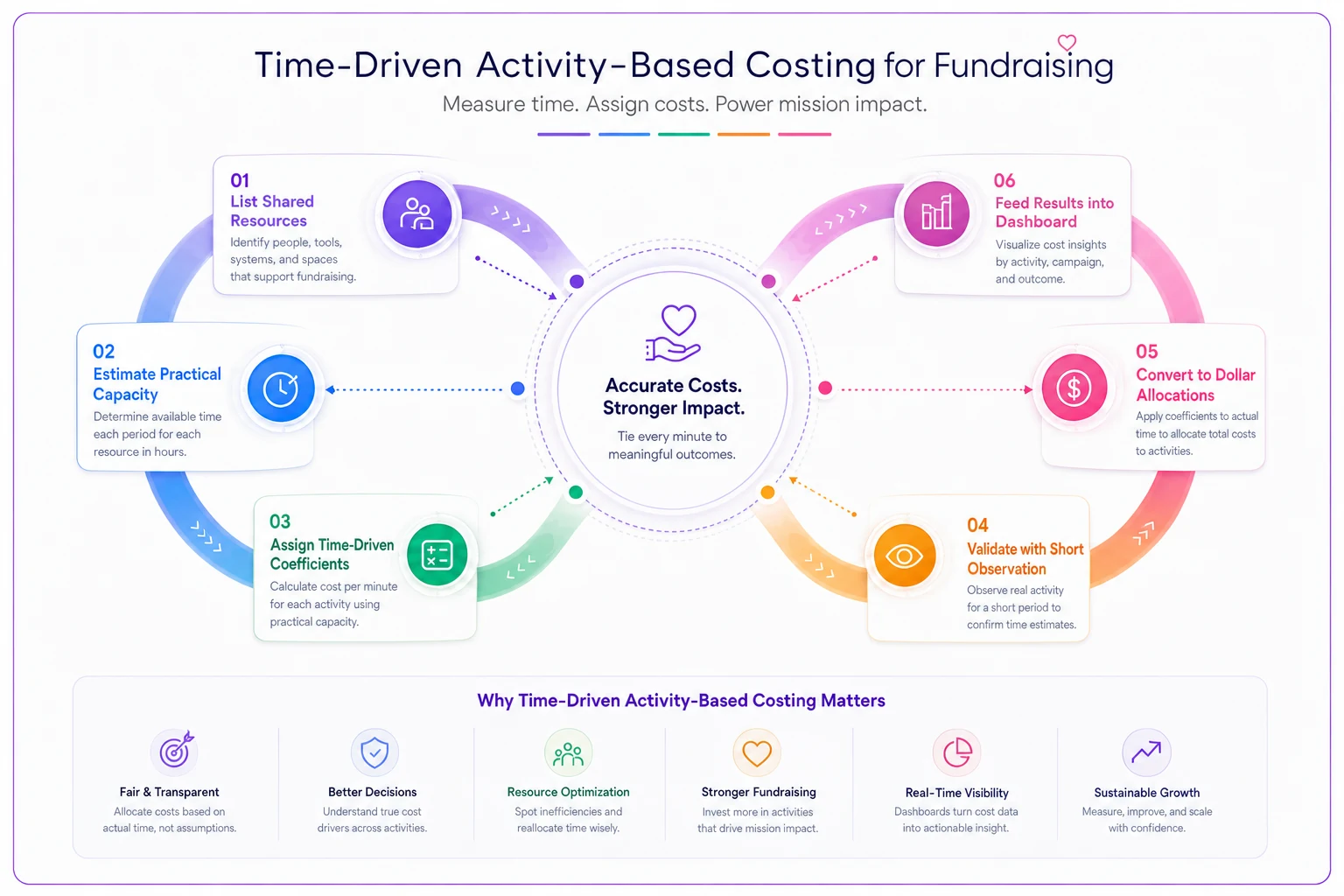
You don't need precision to start; you need a defensible, repeatable process that leadership can review.
A Worked Example with Numbers
Say a mid-sized org has three shared resources to allocate: a finance manager (fully loaded ~$78k), a database/ops coordinator (~$62k), and the CRM plus tech stack (~$21k/year). That's around $161k of shared cost that traditionally gets smeared across programs by revenue.
Under the old revenue-split, if events raised 20% of total revenue, events absorbed roughly $32k of shared cost. Clean, simple, wrong.
| Activity | Finance mgr | Ops coord. | CRM/tech | Allocated shared cost |
|---|---|---|---|---|
| Major gifts | 15% | 10% | 15% | ~$21k |
| Grants | 30% | 15% | 10% | ~$34k |
| Events | 25% | 30% | 20% | ~$42k |
| Recurring giving | 10% | 20% | 35% | ~$27k |
| Data/acknowledgments | 20% | 25% | 20% | ~$37k |
Events now carry roughly $42k in shared cost — meaningfully more than the $32k the revenue split assigned, because events are operationally heavy relative to what they raise. Recurring giving, which felt "expensive" under the old method, actually consumes less shared staff time than it appeared, even though it leans hard on the CRM.
That's when leadership conversations change. When you pair these activity costs with the revenue each activity generated, you get a real cost-to-raise per activity — not a blended organization-wide ratio. Events at $42k cost to raise $120k is a very different story than events buried inside a 78%/22% program-overhead split where nobody can see what's actually happening.
The Dashboard Leadership Actually Wants
A cost-to-raise number sitting in a spreadsheet cell doesn't change behavior. A clear dashboard does. What tends to work for boards and EDs is a small set of views, not a wall of charts.
-
Cost-to-raise by activity — dollars spent (direct + allocated shared) per dollar raised, per activity, shown as a ratio and a trend line over the last 4–6 quarters. The trend matters more than any single snapshot.
-
Contribution after shared cost — net dollars each activity contributes once its allocated shared cost is subtracted. This is the number that kills the "cut the fundraising department" instinct, because it shows what each activity actually nets.
-
Shared resource consumption — where your finance and ops capacity is actually going. Leadership is often surprised to see grant reporting eating 30% of finance capacity; it reframes a hiring conversation immediately.
-
Multi-year value context — a cost-to-raise number for acquisition looks terrible in year one and reasonable over a donor lifetime. Any dashboard that shows acquisition cost without lifetime context is setting up bad cuts.
That last point connects to how you define and measure the numerator and denominator in the first place. If your underlying metrics are inconsistent, the prettiest dashboard just launders bad data faster. It's worth aligning this work with a coherent measurement approach — the pragmatic framework for nonprofit fundraising metrics and attribution covers this in more depth, and the two efforts reinforce each other.
A Quick Checklist Before You Present Anything to the Board
Before putting activity-based numbers in front of leadership, run through this:
-
- [ ] Coefficients were validated against real observation, not just self-estimates
-
- [ ] Practical capacity (not theoretical 2,080 hrs) was used for staff resources
-
- [ ] Direct costs and allocated shared costs are clearly separated in the view
-
- [ ] Restricted-fund activities reconcile with what funders were told
-
- [ ] Acquisition activities show multi-year context, not just year-one cost
-
- [ ] You can explain, in one sentence, why any number changed from last quarter
-
- [ ] The method is documented so a new staffer could reproduce it
That last item is what separates a durable system from a heroic one-time analysis. If the whole model lives in one person's head and one unlabeled spreadsheet, it dies when they leave — and every allocation choice becomes unauditable.
A Real Scenario
A regional arts nonprofit — roughly $1.4M budget, four-person development team — kept getting pushed by its board to cut "administrative" spend because their reported overhead ratio hovered around 24%. The board wanted it under 20%, benchmarked against a peer they'd seen on a rating site.
When they rebuilt costs using time-driven coefficients, two things surfaced. First, close to a third of their "overhead" finance and ops time was actually grant compliance work — directly required by the restricted funding those same board members were proud of. Second, their gala, long treated as the crown jewel, carried far more shared operational cost than anyone had allocated to it; the real cost-to-raise was closer to $0.46 per dollar than the ~$0.30 the old method implied.
Nothing about the actual spending changed overnight. What changed was the conversation. The board stopped chasing an arbitrary ratio and started asking better questions: could the gala's operational load be reduced, and should more of the grant-compliance cost be built into future grant budgets as allowable direct costs? Within two grant cycles they'd recovered a meaningful chunk of that compliance time as budgeted line items rather than unfunded overhead — a swing in the low tens of thousands — and more importantly, a board that finally understood what it was looking at.
When This Makes Sense — and When It Doesn't
When it's worth doing: You have meaningful shared costs (multiple staff touching multiple programs), restricted funding that demands defensible allocation, or a board that keeps making decisions off the overhead ratio. Once you're past roughly three or four programs sharing the same people and systems, revenue-split allocation is actively misleading you.
When it's overkill: A one- or two-person shop with a single program and almost no shared cost doesn't need coefficients — you'd spend more time modeling than the model could ever save. A rough direct-cost tally is fine at that scale.
Who should not attempt this yet: Orgs whose underlying financial and CRM data is still a mess. Activity-based costing sits on top of clean data — it doesn't fix it. If your revenue can't be reliably tied to source and your expenses aren't consistently coded, fix that foundation first. Otherwise you'll build a sophisticated model on numbers you can't trust, which is worse than a simple ratio because it looks authoritative.
Keeping It Alive as You Grow
The failure mode isn't building the model. It's maintaining it. Coefficients drift, staff turn over, programs launch and sunset, and within a year your initially honest allocation is quietly wrong again. This is where the manual-spreadsheet version starts to strain — pulling revenue by source from the CRM, matching it against coded expenses, re-applying coefficients every quarter, and rebuilding the dashboard becomes a recurring chore nobody wants to own.
This is the point where operational software that already centralizes your gift data, expense coding, and reporting starts paying off — not because it does the thinking for you, but because it removes the reconciliation grind that makes people abandon the model. When revenue is already tied to source and shared costs are categorized in one place, refreshing coefficients and regenerating the cost-to-raise view becomes a quarterly review instead of a week-long rebuild. AI-assisted allocation can even flag when an activity's actual resource consumption has drifted from its assigned coefficient, prompting a re-estimate before the numbers go stale.
The goal isn't a fancier dashboard. It's a costing picture that stays honest without requiring a heroic effort every quarter.
Overhead ratios aren't going away — funders and rating sites still ask for them. But you don't have to let a blended percentage stand in for actual understanding. Attribute shared costs to the activities that consume them, show leadership the real cost-to-raise per program with the lifetime context that makes it fair, and the whole strategic conversation shifts from "cut overhead" to "invest where the returns actually are." That shift, more than any single number, is what activity-based costing gives a fundraising team.
Ready to elevate your fundraising efforts?
Join 2,000+ nonprofits using Givioly to save time, increase donations, and build lasting donor relationships.