



Most fundraising teams that try cohort analysis end up with a chart nobody uses. They group donors by acquisition month, plot retention lines that all slope downward, nod at the screen, and go back to running the same appeals they were running before. The problem almost never lives in the math. It lives in how the cohorts were defined in the first place.
Cohort analysis for nonprofits is powerful precisely because giving behavior is sticky and time-based. A donor acquired during a December year-end push behaves very differently from one acquired after a disaster appeal, even if their first gift was the same $50. Lump them together—or split them the wrong way—and you get averages that hide the exact thing you were trying to find. This piece walks through the setup mistakes that quietly ruin cohort work, gives you queries you can actually run, and lays out a 90-day plan that ties each cohort to a real decision instead of a pretty line.
The Setup Mistakes That Make Cohort Analysis Useless
Before any SQL, you need to get the grouping right. Get this wrong and everything downstream is noise.
Mistake 1: Defining cohorts only by acquisition month. This is the default everyone reaches for, and it's the weakest cut. Acquisition month tells you when someone gave first, but not why or how. Two donors who both joined in November could have come from a peer-to-peer walk and a Facebook ad—two completely different retention futures. Month-only cohorts blend them and give you a mushy 22% second-year retention number that's true for nobody.
Mistake 2: Using first gift amount as a cohort dimension instead of a filter. Gift size matters, but it's a symptom of channel and campaign, not an independent driver you can slice cleanly. Teams that build cohorts by dollar band ($0–25, $26–100, $101+) end up staring at the obvious—bigger first gifts retain better—without learning anything actionable.
Mistake 3: Mixing one-time and recurring donors in the same cohort. A monthly donor acquired in March and a one-time donor acquired in March are not the same cohort. Their retention curves are so different that averaging them produces a line that describes neither. Recurring donors need their own cohort universe entirely.
Mistake 4: Counting "retained" inconsistently. Is a donor retained in year two if they gave any gift, or a gift in the same giving season, or a gift of comparable size? Teams switch definitions between reports without noticing, then wonder why the numbers don't reconcile. Pick one definition and write it down.
| Dimension | Weak version | Strong version |
|---|---|---|
| Acquisition date | Calendar month | Acquisition season (Year-End, Spring Appeal, Off-cycle) |
| Channel | "Online" vs "Offline" | Specific source: P2P event, paid social, direct mail, organic web |
| Gift type | Ignored | One-time vs recurring, tracked separately |
| Retention rule | "Gave again" (vague) | Gave a qualifying gift within 13 months of first gift |
The strong version costs you nothing extra in data—you almost certainly already capture channel and gift type—but it changes the analysis from decorative to directional.
Stepwise Cohort Build: Acquisition Date, Channel, Gift Type
Build cohorts in layers, not all at once. Here's the order that keeps you out of trouble.
Simplify donor management and fundraising workflows.
Givioly helps you organize campaigns, engage donors, and maximize fundraising impact seamlessly.
- Unified donor profiles
- Real-time donation tracking
- Automated impact reporting
No credit card required
-
Define the acquisition event. Pick the moment a donor "enters." For most teams this is the date of first successful gift. Write down the edge cases now: What about a $0 pledge that never paid? A soft-credit gift? Decide before you query, not after.
-
Assign each donor to an acquisition season, not a raw month. Bucket the year into meaningful giving windows for your org. A typical setup: Year-End (Nov–Dec), Spring Appeal (Mar–Apr), Summer (Jun–Aug), and Off-cycle for everything else. Seasons capture campaign context that months miss.
-
Tag the acquisition channel—singular and specific. Every donor gets exactly one acquisition channel, the source of their first gift. Resist the urge to attribute to the "best" touch. First-gift channel is what you can act on.
-
Split by gift type into two parallel cohort tables. One-time donors and recurring donors get separate analyses. You'll report them side by side, but you never average across them.
-
Compute a retention flag per donor per year. For each donor, mark whether they made a qualifying gift in months 13–24 after acquisition. This is your dependent variable.
-
Roll up to cohort-level rates only at the end. Individual-level flags first, aggregation last. This lets you re-slice later without rebuilding.
The reason for this order: if you aggregate too early, you lose the ability to answer follow-up questions. Someone will ask "what about first-time recurring donors from the spring event specifically?" and if you built at the donor level, that's a five-minute filter instead of a rebuild.
Sample SQL You Can Adapt
Assume a simplified gifts table with donorid, giftdate, amount, channel, and gift_type. Adjust column names to your CRM export.
Step 1 — Find each donor's acquisition gift:
WITH firstgift AS ( SELECT donorid, MIN(giftdate) AS acqdate FROM gifts GROUP BY donorid ), acquisition AS ( SELECT g.donorid, g.giftdate AS acqdate, g.channel AS acqchannel, g.gifttype AS acqgifttype, g.amount AS acqamount FROM gifts g JOIN firstgift f ON g.donorid = f.donorid AND g.giftdate = f.acqdate ) SELECT * FROM acquisition;
Step 2 — Assign acquisition season:
SELECT donorid, acqchannel, acqgifttype, CASE WHEN EXTRACT(MONTH FROM acqdate) IN (11,12) THEN 'Year-End' WHEN EXTRACT(MONTH FROM acqdate) IN (3,4) THEN 'Spring Appeal' WHEN EXTRACT(MONTH FROM acqdate) IN (6,7,8) THEN 'Summer' ELSE 'Off-cycle' END AS acqseason, acq_date FROM acquisition;
Step 3 — Flag retention (a qualifying gift in months 13–24):
SELECT a.donorid, a.acqchannel, a.acqgifttype, MAX(CASE WHEN g.giftdate > a.acqdate + INTERVAL '12 months' AND g.giftdate <= a.acqdate + INTERVAL '24 months' THEN 1 ELSE 0 END) AS retainedy2 FROM acquisition a LEFT JOIN gifts g ON g.donorid = a.donorid GROUP BY a.donorid, a.acqchannel, a.acqgift_type;
Step 4 — Roll up to cohort retention rates:
SELECT acqseason, acqchannel, acqgifttype, COUNT() AS cohortsize, ROUND(AVG(retainedy2) 100, 1) AS retentionpct FROM cohortflags GROUP BY acqseason, acqchannel, acqgifttype HAVING COUNT(*) >= 25 ORDER BY acqseason, retentionpct DESC;
That HAVING COUNT(*) >= 25 line matters more than it looks. Cohorts smaller than around 25 donors swing wildly on a couple of gifts, and small teams love to over-interpret a cohort of 6 donors that "retained 83%." Suppress the tiny cohorts or you'll spend time chasing ghosts.
The Spreadsheet Version, for Teams Without SQL Access
Plenty of fundraising shops live in exported CSVs and Google Sheets, and that's fine. The logic is identical:
-
Column A
donor_id -
Column B
acqdate— use=MINIFS(giftdaterange, donorrange, A2)to find first gift -
Column C
acq_season— a nestedIFon the month of B -
Column D
acq_channel— pulled from the acquisition-gift row -
Column E
retained_y2—1if any gift falls in the 13–24 month window, usingCOUNTIFSwith date bounds -
Then a pivot table
rows = season + channel, values = count and average of
retained_y2
The one thing spreadsheets make easy to break is the retention window. People anchor it to a fixed calendar year instead of each donor's acquisition date, which silently shortens the window for late-year donors. Always compute the window relative to the individual acquisition date.
Visualization Templates That Don't Mislead
The classic cohort visual is the triangle heatmap—cohorts as rows, months-since-acquisition as columns, cells shaded by retained percentage. It's good, but for fundraising it's often overkill and easy to misread.
Two simpler templates tend to drive more decisions:
The season-by-channel retention bar chart. Group bars by acquisition season, colored by channel. This makes the "our Year-End paid-social donors retain at 11% while our Spring event donors retain at 38%" story pop instantly. That's a slide a board understands.
The recurring-vs-one-time survival line. Two lines, months on the x-axis, share of cohort still active on the y-axis. Keep recurring and one-time on the same chart but never merge them. The gap between the lines is usually the single most persuasive argument for investing in monthly giving—and it connects directly to the mechanics in scaling monthly giving programs.
One visualization mistake worth flagging: plotting cumulative dollars per cohort instead of retention rate. Cumulative dollars always goes up and always makes recent cohorts look bad simply because they've had less time. Rate-based views keep the comparison honest.
A 90-Day Experiment Plan Tied to Real Decisions
Cohort analysis is only worth the effort if it ends in a decision. Here's a 90-day arc where each phase produces a concrete choice, not just a report.
[GRAPH: 90-Day Cohort Experiment Timeline — Days 1–30: Build baseline and identify worst cohort → Days 31–60: Run single intervention (split test) against target cohort → Days 61–90: Read early signal via 90-day second-gift rate → Decision: Scale, iterate, or drop]
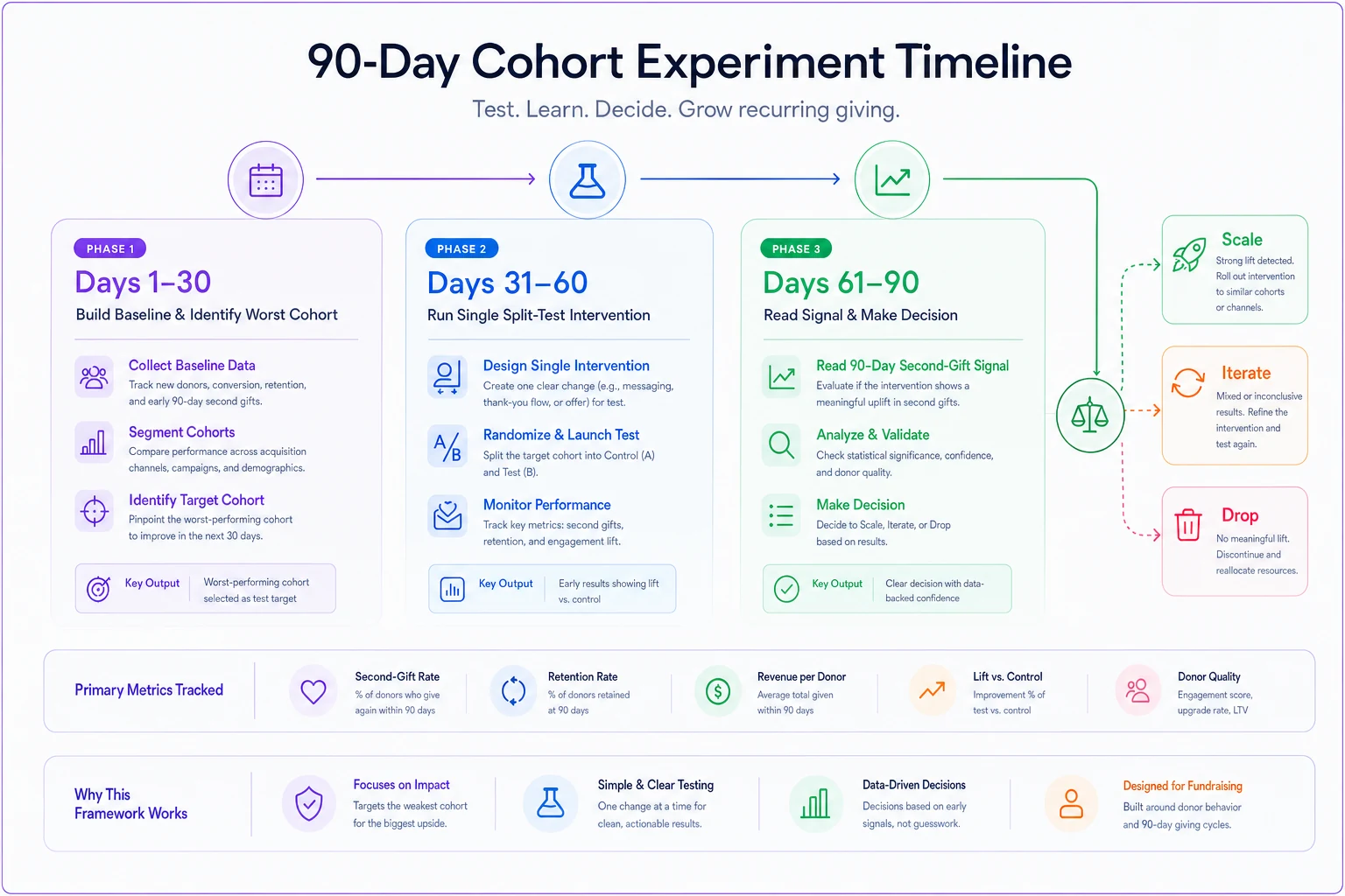
Days 1–30: Build the baseline and pick the fight. Construct the donor-level cohort table using the steps above. Produce one artifact: the season × channel × gift-type retention grid. Then find your worst honest cohort—a large one with poor retention. Maybe it's Year-End one-time donors from paid social retaining at 9%. That's your test target. Decision at day 30: which single cohort are we trying to move?
Days 31–60: Run one intervention against one cohort. Take next season's incoming donors in that same channel and split them. Half get your standard flow; half get a modified onboarding—say, a personal thank-you call within 48 hours and a second-gift ask timed to month two instead of month five. Keep the groups roughly balanced. Log everything at the donor level so it slots into your existing cohort table. Decision at day 60: is the treated group's early second-gift rate meaningfully higher?
Days 61–90: Read the early signal and commit. You won't have 13-month retention yet, so use a leading indicator: second-gift rate within 90 days, which historically correlates with year-two retention in most donor files. Compare treated vs control. If the treated group's early repeat rate is clearly higher—not a rounding-error difference—commit to rolling the intervention out to that channel org-wide. If flat, kill it cleanly and move to the next-worst cohort. Decision at day 90: scale, iterate, or drop.
The discipline here is one cohort, one intervention, one decision per cycle. Teams that try to test five things across ten cohorts at once end up unable to attribute any change to any cause.
A Real Scenario with Numbers
A regional food-security nonprofit, roughly $1.4M in annual revenue, ran their first proper cohort build and found something their blended dashboard had hidden for years. Overall second-year retention sat around 24%—unremarkable. But once split by acquisition channel and gift type, the picture broke apart: direct-mail acquired one-time donors retained near 41%, while a heavily-funded paid-social push was producing donors retaining at about 8%.
They'd been pouring roughly $18k a year into that social channel because it drove the most new donors per dollar. On a first-year basis it looked efficient. On a cohort basis it was a leaky bucket—those donors almost never came back, so the true cost per retained donor was several times higher than direct mail.
Their 90-day test wasn't to kill social. It was to change the onboarding for social-acquired one-timers: an immediate impact-focused thank-you and an early, low-pressure second ask. Over the following season the treated group's 90-day second-gift rate landed around 19% versus roughly 7% for the control. Not a miracle—but enough of a lift to justify keeping the channel with the new flow rather than cutting it. The cohort analysis didn't just produce a number; it changed where money went.
When Cohort Analysis Is Worth It—and When It Isn't
When it makes sense: You have at least a couple of years of gift history and enough donors that cohorts clear the ~25-donor floor. You're deciding where to spend acquisition dollars or whether an onboarding change is working. You have channel and gift-type data captured cleanly at the point of first gift.
When it's a bad idea: You're a very young or very small file where every cohort is tiny—you'll over-read random noise. Or your channel data is missing or unreliable, in which case fix data capture first; cohorting garbage just produces confident garbage.
Who should skip it for now: Teams whose acquisition source isn't recorded on the gift record. Without a trustworthy first-gift channel, the most valuable cut isn't available, and season-only cohorts rarely justify the setup effort. Getting that field populated is the prerequisite, and it ties directly into how you define and track your broader fundraising metrics and attribution.
Keeping Cohorts Alive After the First Build
The most common failure isn't the initial analysis—it's that nobody ever runs it again. A cohort grid built once and abandoned tells you about last year's mistakes and nothing about whether you're fixing them. The fix is to make the donor-level cohort table a scheduled refresh rather than a one-off project, so each new acquisition season drops in automatically and you can watch treated cohorts mature over the following year.
This is where centralizing your gift, channel, and gift-type data in one place—rather than re-exporting and re-joining CSVs every quarter—pays off. Whether that's a proper database, a maintained set of connected sheets, or an operational platform that keeps acquisition fields clean at the point of entry, the goal is the same: the cohort table should regenerate on its own so the analysis becomes a habit instead of a heroic quarterly effort.
Run the cohort-table refresh alongside your monthly ETL or sheet-sync jobs so new acquisitions land automatically in the next scheduled cohort run.
Cohort work rewards teams who keep the grouping honest, suppress the tiny cohorts, tie every read to one decision, and come back to it season after season. Do that, and the downward-sloping retention lines stop being something you nod at and start being something you actually move.
Cohort work rewards teams who keep the grouping honest, suppress the tiny cohorts, tie every read to one decision, and come back to it season after season. Do that, and the downward-sloping retention lines stop being something you nod at and start being something you actually move.
Ready to elevate your fundraising efforts?
Join 2,000+ nonprofits using Givioly to save time, increase donations, and build lasting donor relationships.